


No items found.
Since the early 1980s, Fruju has been a staple of the Kiwi summer. Over time, it began to lose its visual punch, along with its sense of relevance. We couldn’t let that slide.
It was time to refresh the refreshment.
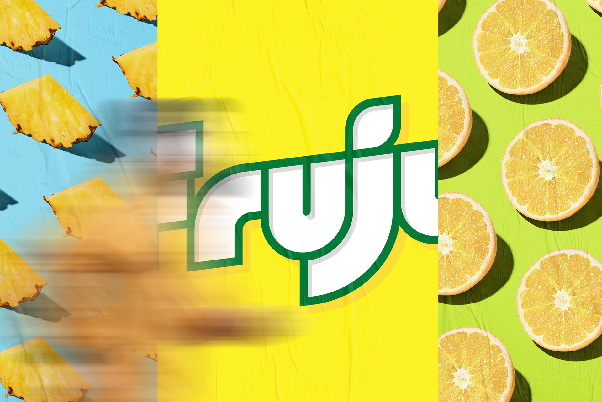
Drawing from the brand’s original cues, we brought boldness back into the system. A confident, high-impact wordmark leads the way, designed to feel both new and instantly familiar. A modern icon for an already iconic name.
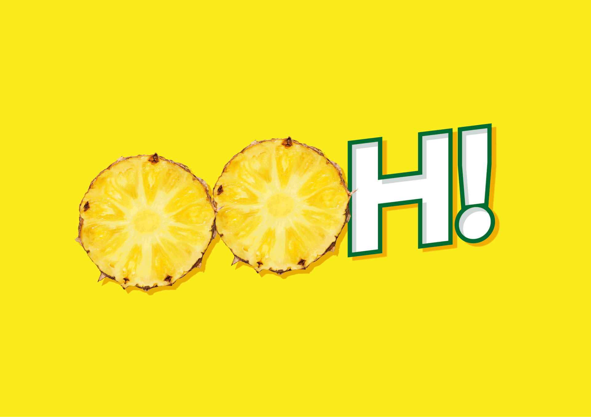
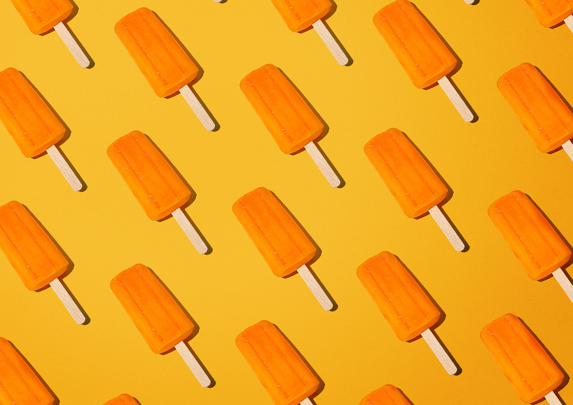
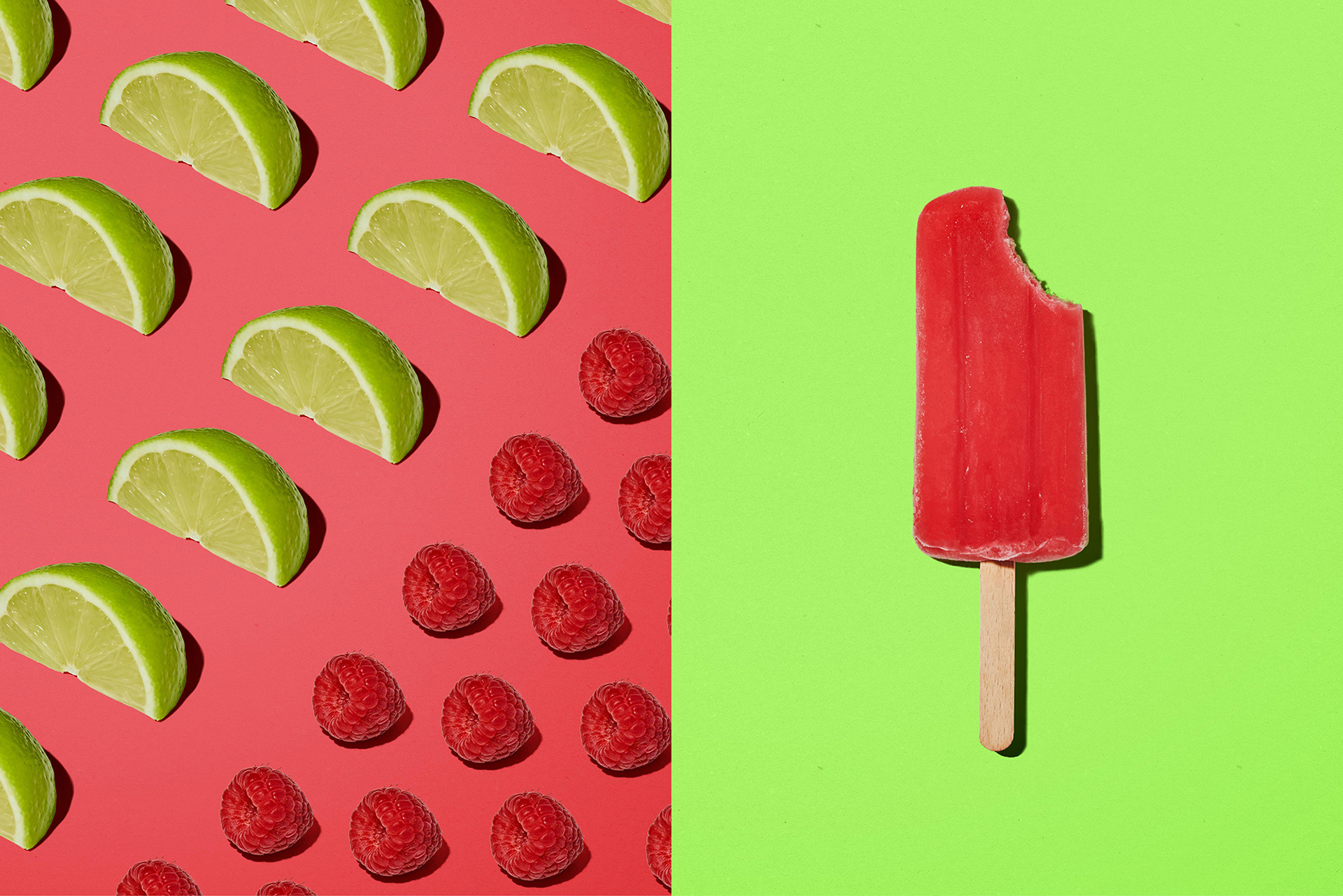
A palette of vivid, high-energy colour, paired with oversized, indulgent fruit, creates a world that feels as juicy and refreshing as the product itself. Flavour, fun, and shelf impact dialled all the way up across packaging and beyond.
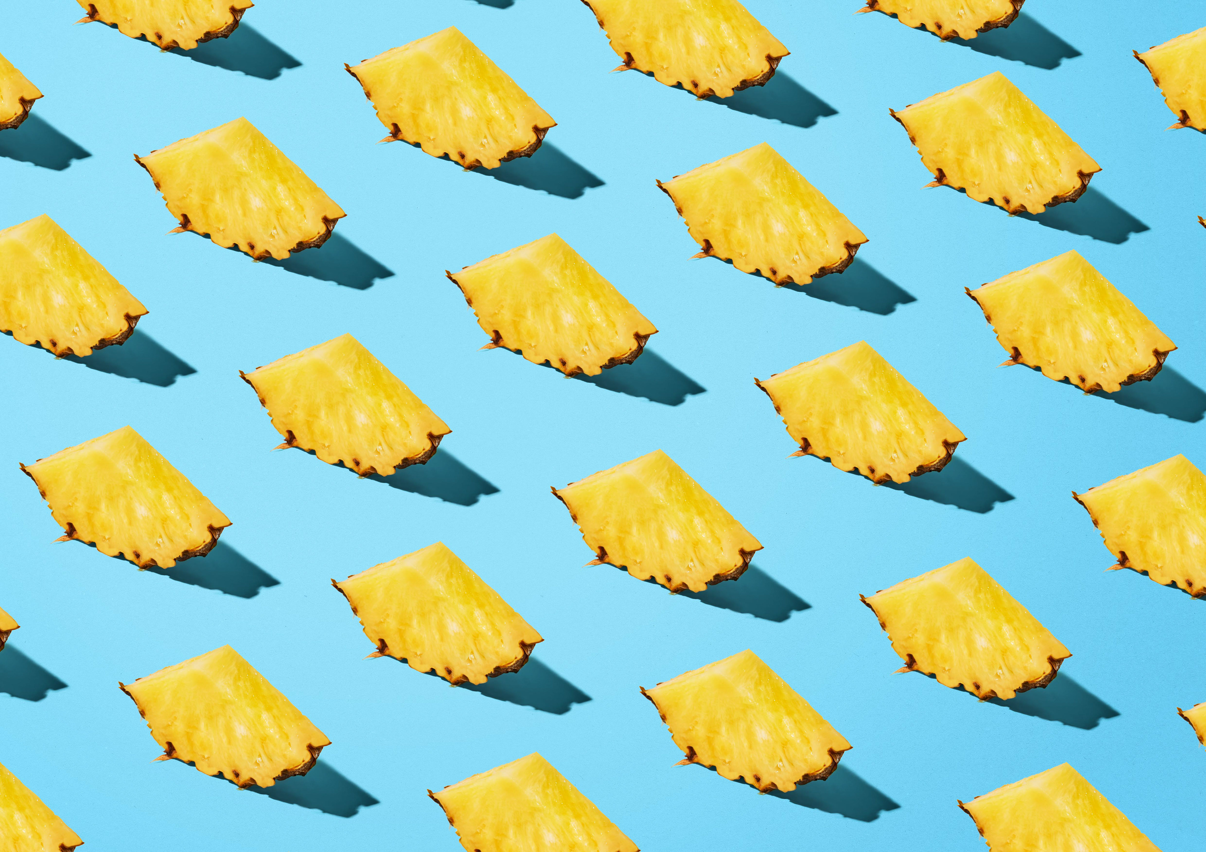
Photography leans into the unmistakable feeling of a Kiwi summer. Bright light, crisp shadows, and sun-soaked moments bring Fruju to life at its most refreshing.
Worked on while at Designworks